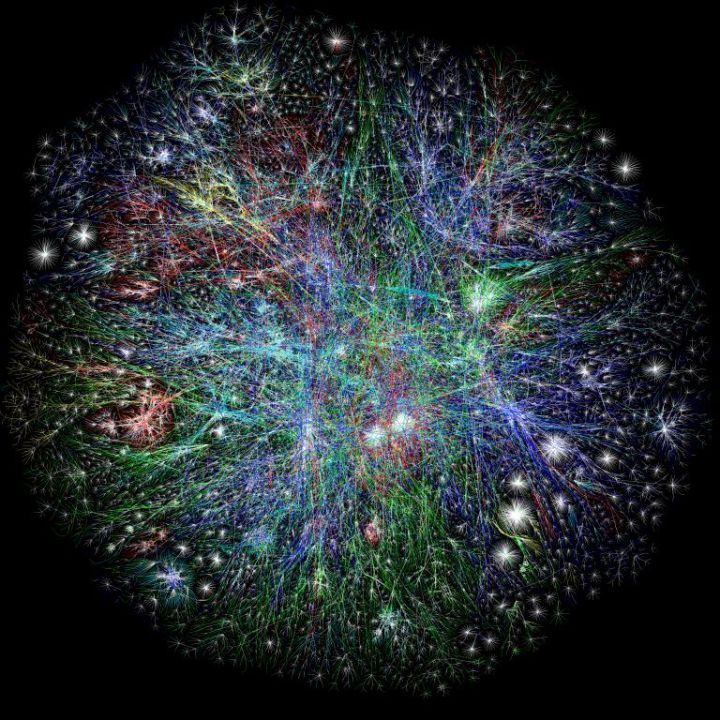
This visualization of the internet was used near the end of the TED Talk, “We Are All Cyborgs Now,” which was featured on e4e a few weeks ago.
The Opte Project created this map in 2003. The colors show internet activity in these locations:
Red – Asia Pacific
Green – Europe/Middle East/ Central Asia/Africa
Blue – North America
Yellow – Latin American and Caribbean
Cyan – local area networks
White – unknown
They also created other maps using file extensions like mil, net, edu, org, et cetera. That is, they visualized internet activity for the military, education, and other organizations instead of by location. I’m sure this image would be significantly different in 2011.
UPDATE: See the 2010 version, which was released in 2014.


2 thoughts on “A Visual Look at the Internet”