
In an earlier post, How to Add a Give Button to Your WordPress Sidebar, I described the steps to put a clickable “give” button on your WordPress blog. Today, my friends, Steve and Terry, mentioned the importance of the size and placement of a give button for mobile devices, so I thought I’d look into it for you.
The Size of Your Give Button
The first article I read, Finger-Friendly Design: Ideal Mobile Touch Target Sizes, explained that many phone manufacturers recommend pixel widths for a smartphone “target” (in this case, your give button) from 26 to 44 pixels wide; however, the average adult thumb is 72 pixels wide. My “rule of thumb” would be to view your website’s give button (and your MailChimp or email give button) on your phone and see if the button is as big as an adult male’s thumb. Of course, your site could look absolutely ugly with this huge button, so you’ll have to make a judgment call about how big you want the button to be. The larger the button, though, the less errors. You don’t want your friends frustrated when they try to follow your links.
Where You Place the Give Button
I actually liked the suggestion of the second article, Mobile Website Optimisation, of making a rectangular button that reaches from the left side to the center of the screen. This placement is easy to reach for both a right and left-handed person. Additionally, the button would be larger, but not as overwhelming as a square button might be. If this button is wider than a thumb, the edges of it will show to help visually when the thumb is over the button.
The second article made several additional good points. Here’s a few:
- When possible, use a button, not a link, since a hyperlink is a smaller target to hit.
- Big buttons are better under poor lighting conditions.
- Leave space around buttons so the reader doesn’t accidentally hit an adjacent button or hyperlink.
- A button should look like a button. 3-D effects are best.
- A button on the left-hand side of a screen is easier for a right-handed person to reach.
- If using hyperlinks in a post, keep them to a minimum, and widely spaced, so they’re easy to “hit”.
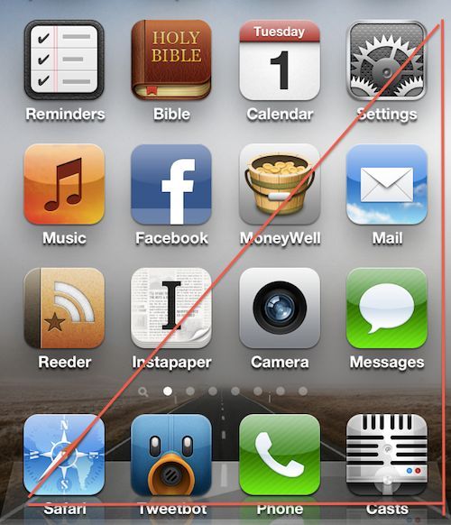
The triangular area on the above phone image shows the range of the thumb for a right-handed person, so, as much as possible, I would place a rectangular give button starting in the lower left corner of the triangle; you don’t want it too high. Try it out yourself, walking and using your thumb to reach your give button.
Thanks to Terry and Steve Morgan for the tip today! It looks like I have a little work to do on my give buttons! Do you?
Follow the Morgans:
- Mentors4Movements
- Steve’s blog: Leader Impact
- Terry’s blog: maturitas cafe

Thanks for visiting us today Sus and for sharing your insights. I picked up many other great ideas from your time with us! Thanks for being a blessing!
LikeLike
You’re welcome! You were a blessing, too. Thanks for encouraging me. I also needed your tip for an easy post last night. I hope you get some visitors to your blogs from this. You both deserve more readers.
LikeLike
Thanks Sus for being our fan!
LikeLike
So well researched, Sus! You really added to our “tip”! It was great to see you today… you did a great job and left many from our team excited with action steps to take! Appreciate you… lots!
LikeLike
Thank you, Terry. I’m so glad to hear it was a good time for many on your team. It’s simply fun for me seeing staff willing to make a change and take some positive steps.
LikeLike