
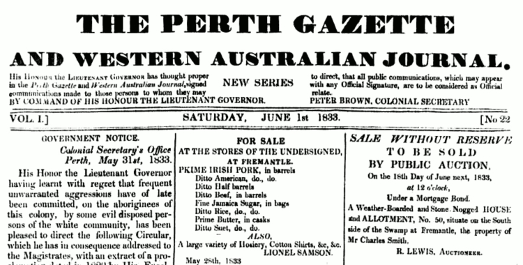
Do you need to update the look of your blog or website? This photo of a century-old newspaper looks cluttered to the modern reader; we like lots of white space. Ouch. I need to examine some of the clutter on my blogs. Why not join me and think through the look of your blog, too?
Put Your Key Content “Above the Fold”
Think of your blog or newsletter as if it’s a newspaper. Your most important content needs to be “above the fold,” or whatever shows when your website loads into the browser. Studies show that 10% of your readers don’t scroll; 60% scroll for “one more window of content.” Most of the time, then, it’s not worth it to write longer than what your friend sees by scrolling once. If your follower is thumbing through content on their phone, I can imagine they’ll bail out even sooner. Make sure what you really want to say is in your first paragraph.
Remember, too, what I recommended in part one in the website posts of the You-Can-Too series: be sure to choose a blog theme that is “responsive,” which means your website will adjust to the screen size of your friends’ devices so they can easily catch up with your latest news on a phone or tablet. (I go into more detail about Layouts in another post.)
Other research shows that an optimum length for a blog post is 1600 words, or what can be read in 7 minutes. (Source: Buffer’s blog) Personally, I don’t like getting even close to 1000 words in eQuipping for eMinistry. Maybe that’s because this blog has less inspirational and more instructional posts.
Good Photos Demand a Closer Look
Great photos are a must for every blog post. That’s what stops my eye! I want to check out the article that goes with the arresting image. With so much competition for attention on the internet, draw your followers in to stop and take a look at what you have to say.
Many blogs only include a brief post with their photo. This style may work well for you since you can put something up quickly. This may also appeal to your friends and followers who would appreciate a quick peek at your life and ministry. Especially since many of our readers are using their mobile devices, they want to just “grab and go.” If they had to sit down and read, they may skip over your blog post for later (and may even not get around to reading it). Experiment with posting more frequently, simply publishing a photo and a short paragraph . Save your longer content for your monthly printed prayer letter.
Would you like to share your website with us? Put a link in the comments.
<< First (in You-Can-Too series)
< First Next (in website posts) >

Visit the Table of Contents for the You-Can-Too series posts. This post is second in the website series. Keep following the series for posts on databases, communication, websites, and social media.
NOTES:
- The e4e 2014 Blog Tour is wrapping up. Why not check out some of the blogs of these Cru writers to get some ideas for your blog?
- Why Layouts Are Important by eQuipping for eMinistry
- F-shaped Pattern for Reading Web Content from the Nielsen Norman Group
- Find more SEO help on eQuipping for eMinistry
- Also see “The Best SEO Page Layout” by Blog SEO
- Are People Browsing or Reading Your Content? by eQuipping for eMinistry
 Source: The image of the Perth Gazette is in the public domain.

3 thoughts on “The Look of Your Blog”